Driving Density Maps
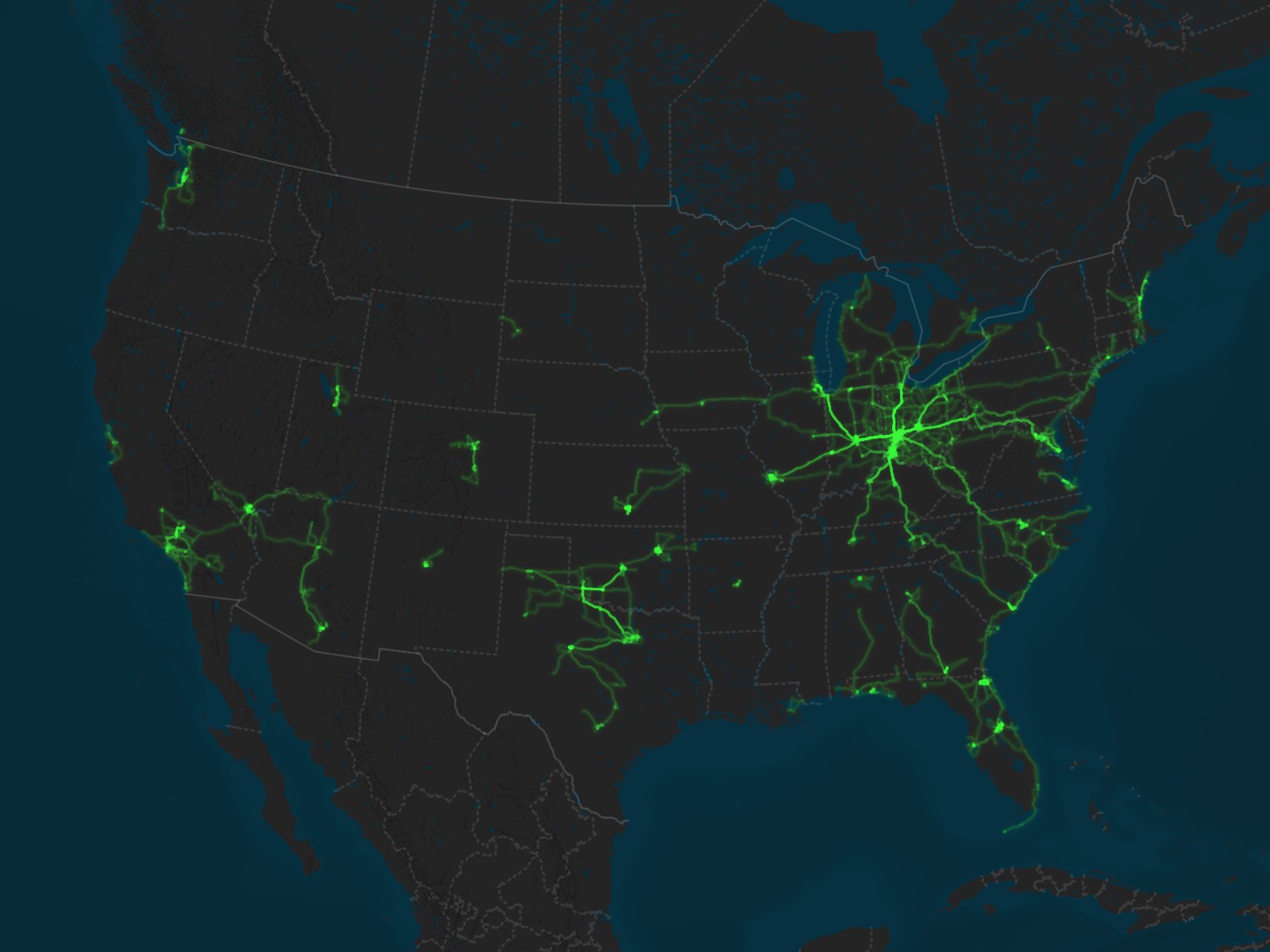
Paul’s Driving: North America (as of 24 Mar 2026)
Basemap © Mapbox © OpenStreetMap (Improve this map)
Driving density maps are another way to look at my driving log data—in this case, showing how often I’ve driven in particular areas (going back to 2010, when I started logging drives). The more I’ve driven in a place, the brighter the pink lines become.
To accomplish this effect, I set up QGIS to show each of my tracks as a green line at 5% opacity. I also added a green glow with 20% opacity in the layer rendering. Thus, places I’ve only driven once are close to the background color, but as tracks stack on top of each other, they become more and more opaque.
I used Mapbox Studio to create a custom dark basemap showing water and terrain, giving a good contrast to the driving tracks while still showing geological landmarks.
Table of Contents
Ohio
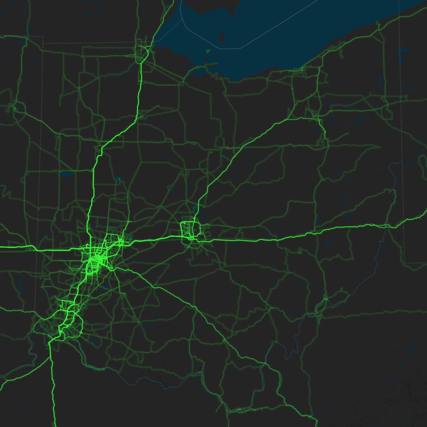
Paul’s Driving: Ohio (as of 24 Mar 2026)
Basemap © Mapbox © OpenStreetMap (Improve this map)
Downtown Dayton
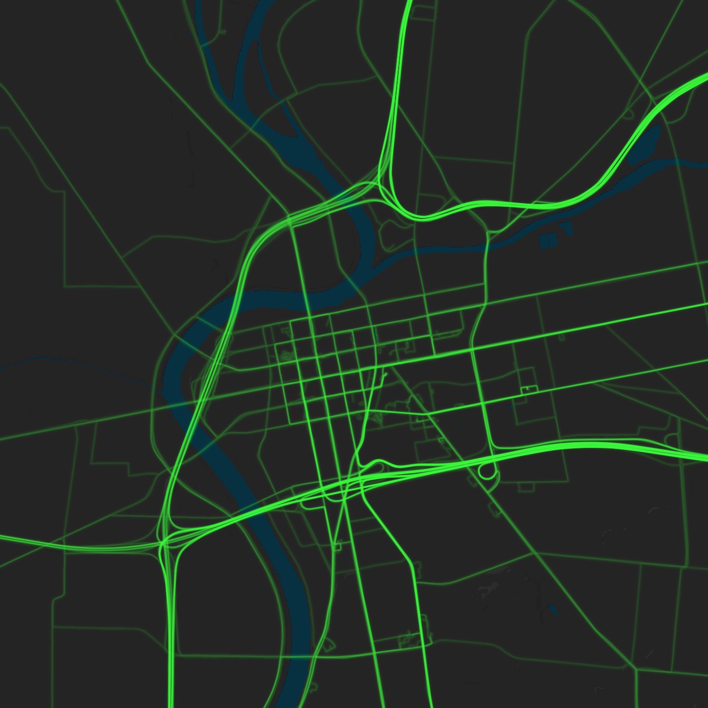
Paul’s Driving: Dayton, Ohio (as of 24 Mar 2026)
Basemap © Mapbox © OpenStreetMap (Improve this map)
Tulsa
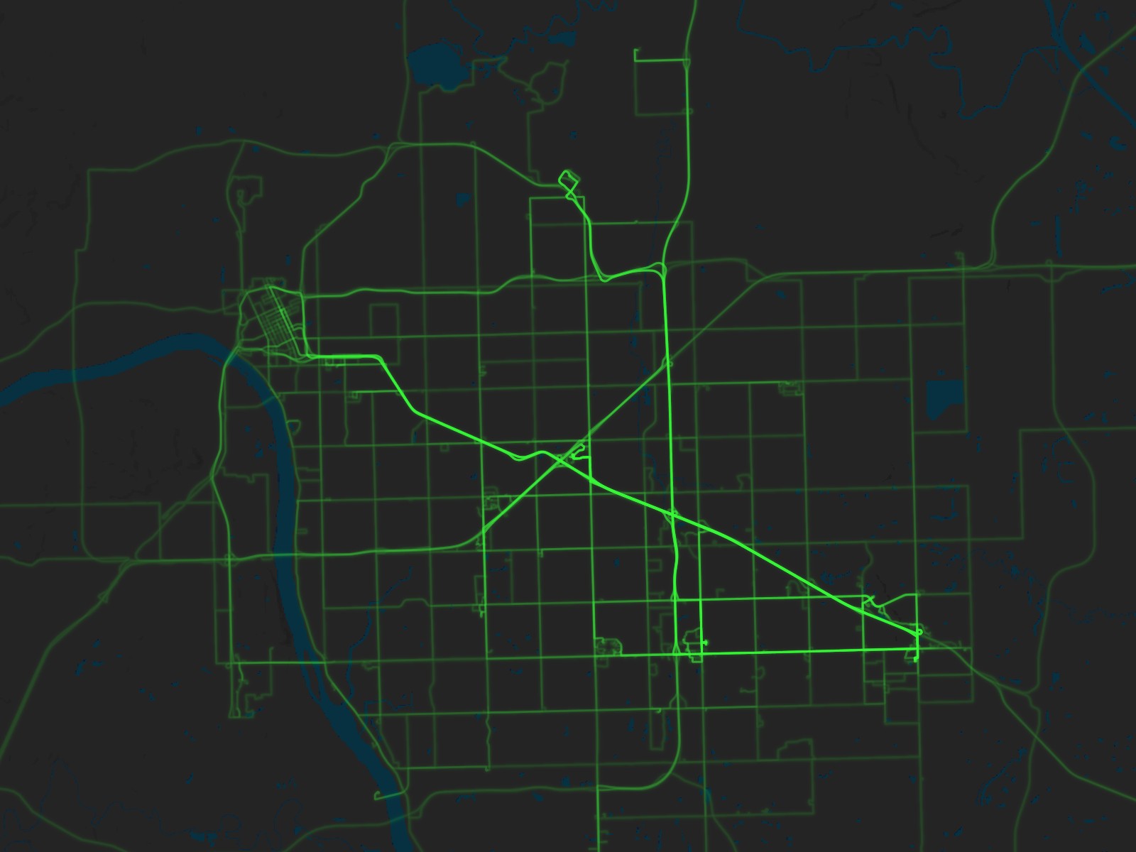
Paul’s Driving: Tulsa, Oklahoma (as of 24 Mar 2026)
Basemap © Mapbox © OpenStreetMap (Improve this map)
Jacksonville
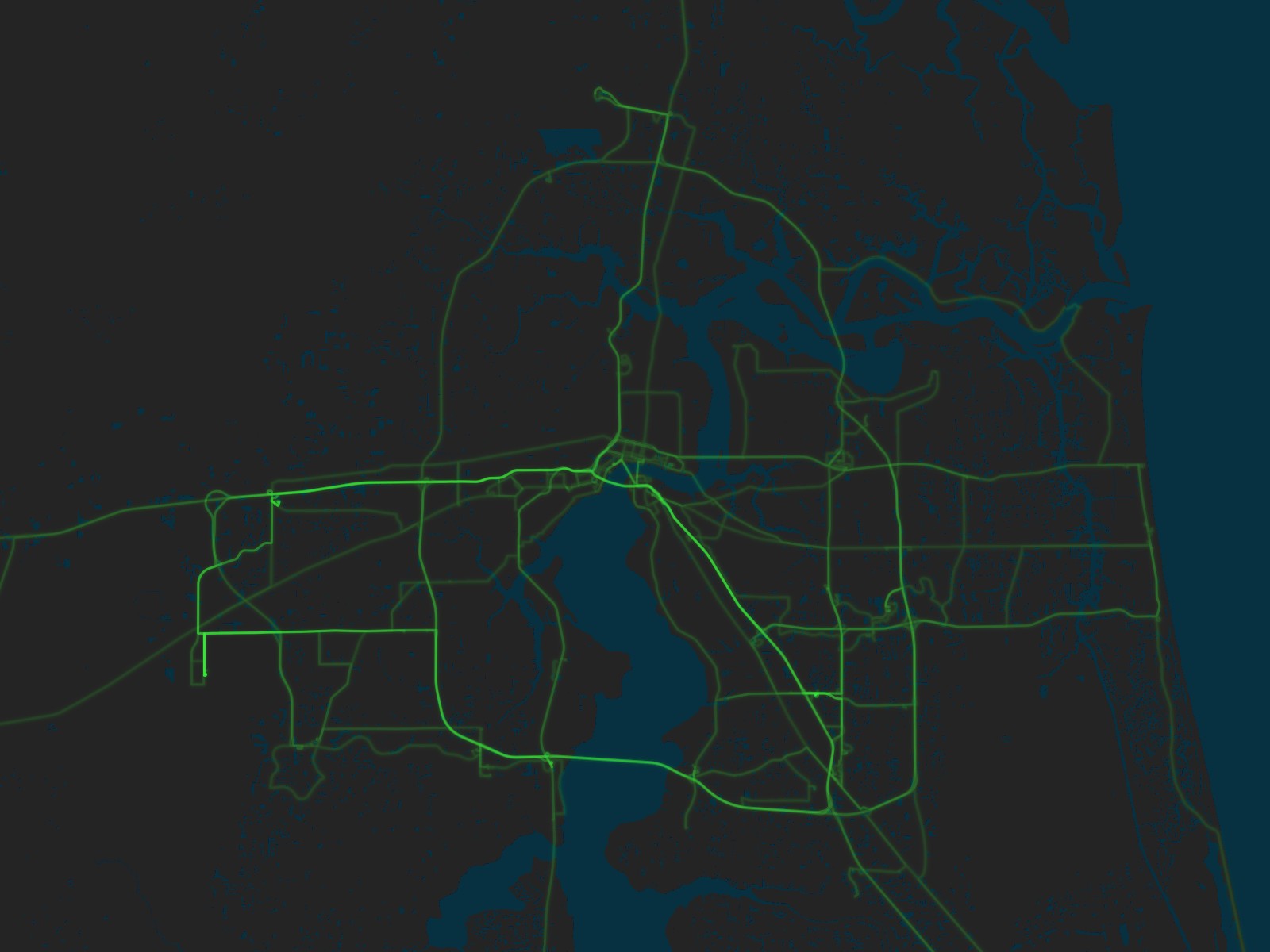
Paul’s Driving: Jacksonville, Florida (as of 24 Mar 2026)
Basemap © Mapbox © OpenStreetMap (Improve this map)
Los Angeles
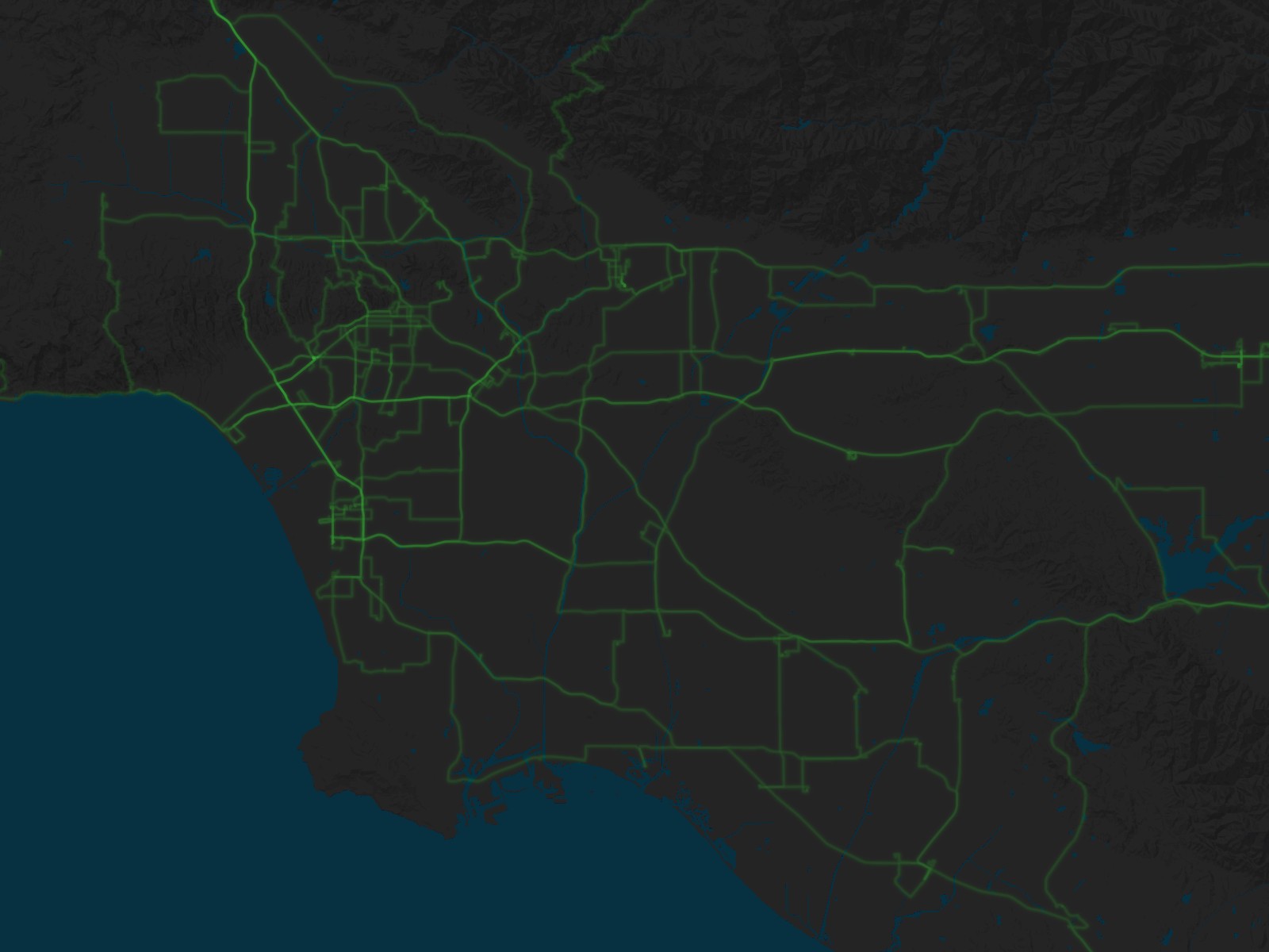
Paul’s Driving: Los Angeles, California (as of 25 Mar 2026)
Basemap © Mapbox © OpenStreetMap (Improve this map)
Seattle
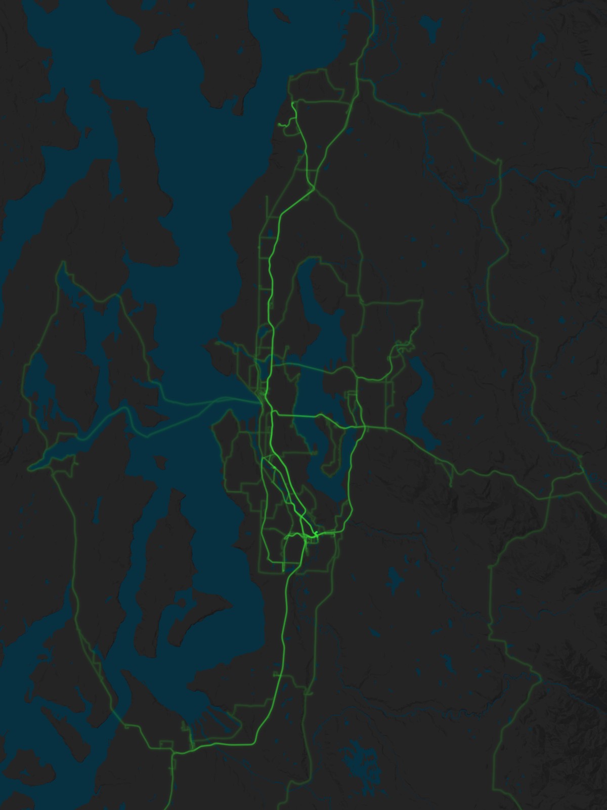
Paul’s Driving: Seattle, Washington (as of 24 Mar 2026)
Basemap © Mapbox © OpenStreetMap (Improve this map)
St. Louis
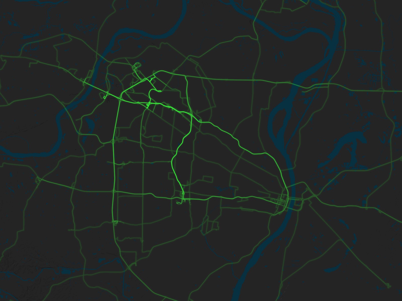
Paul’s Driving: St. Louis, Missouri (as of 24 Mar 2026)
Basemap © Mapbox © OpenStreetMap (Improve this map)
Tucson
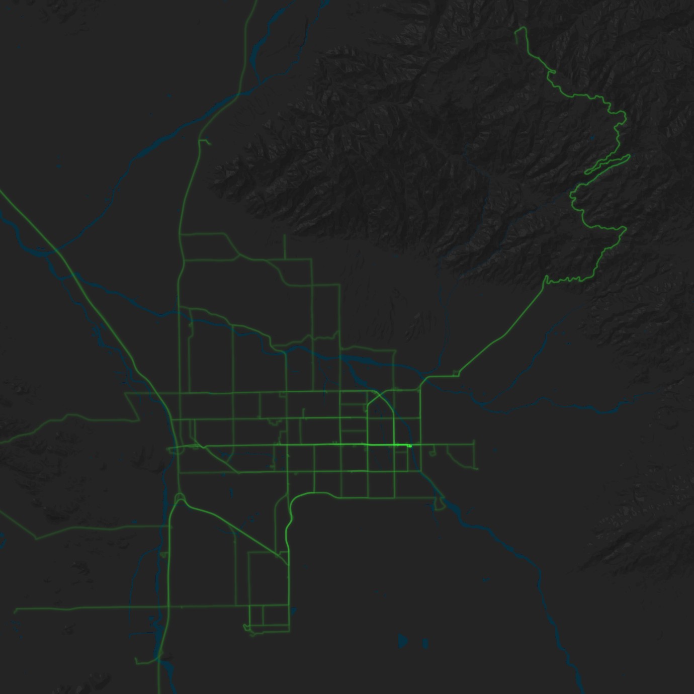
Paul’s Driving: Tucson, Arizona (as of 24 Mar 2026)
Basemap © Mapbox © OpenStreetMap (Improve this map)
Reykjavík
While most of my driving is in the United States, I’ve rented cars in a few other countries, including Iceland.
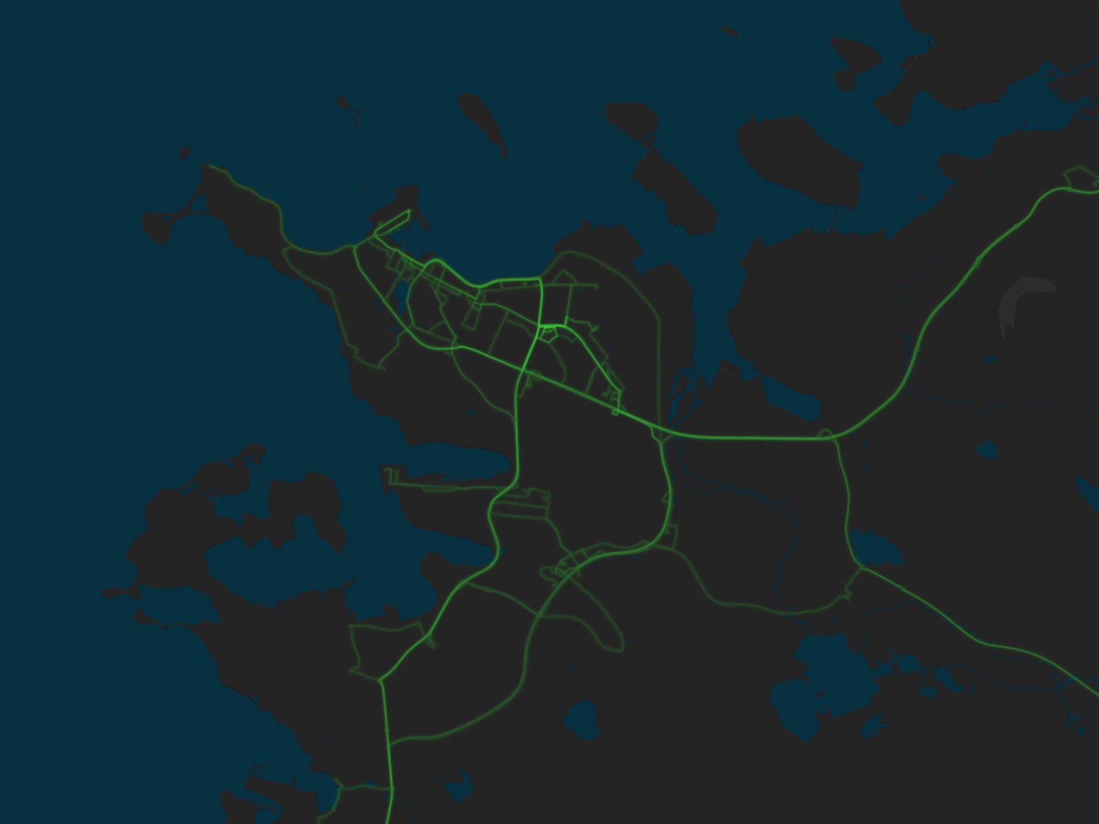
Paul’s Driving: Reykjavík, Iceland (as of 24 Mar 2026)
Basemap © Mapbox © OpenStreetMap (Improve this map)