About the Time Zone Chart
As I travel frequently, I can be in many time zones back-to-back. I wanted a way to show this visually, so I created a Time Zone Chart generator to document my different time zones over the duration of a trip.
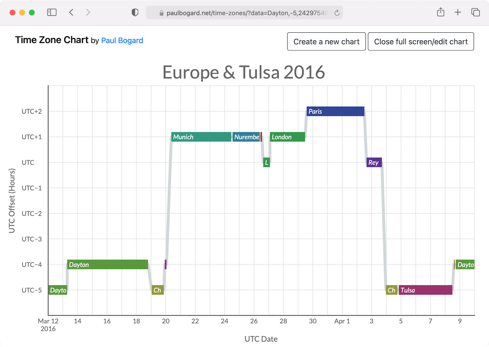
Time Zone Chart for a Europe trip I took in 2016.
UTC (also commonly called Greenwich Mean Time, or GMT1) roughly represents the time along the prime meridian, with no daylight saving/summer time shifts. Time zones around the world are effectively just a difference (offset) from UTC.
For example, Eastern (U.S.) time is four hours behind UTC (UTC−4)—so if it’s 12:00 noon UTC, then you subtract 4 hours from that to find that it’s 08:00 Eastern. During daylight saving time, Eastern switches to UTC−5; this extra offset hour is what causes us to lose an hour in the spring, and gain an hour in the fall.
Every time zone in the world can likewise be represented by an number of hours ahead of (+) or behind (−) UTC. So I created a chart to show UTC offset over the duration of a trip, which would make time zone changes easy to see at a glance.
The (horizontal) x-axis is a timeline in UTC, and the (vertical) y-axis shows how many hours ahead of or behind UTC you were at that time. As you can see from my sample chart above, it shows every time I changed time zones by flying to a different city during a trip by the line moving up and down. It also shows how I changed from standard time to summer time twice in 2016—I was in Dayton, Ohio during the start of U.S. daylight saving time on 13 March, and I was in London during the switch to European summer time on 27 March.

On this London trip, I visited the Royal Greenwich Observatory, which is the point that defines both the prime meridian and Greenwich Mean Time. Unfortunately, I visited the morning following the switch to summer time, so it was no longer Greenwich Mean Time at the Greenwich Observatory!
Technical Details

Time Zone Chart is a single page application I wrote using JavaScript and jQuery. I used moment.js to handle times, as I needed to ensure everything was operating as UTC, and JavaScript’s native Date functionality wasn’t great beyond the user’s local time zone.

The chart is inline SVG, manipulated with JavaScript via the HTML Document Object Model (DOM). (Creating SVG elements requires specifying the SVG namespace, so I did end up having to use document.createElementNS instead of the jQuery element creation functions, which I wrapped in my own createSVG(type, attr) function.)
-
Although UTC and GMT are technically different, for most purposes they can be used interchangeably. ↩︎