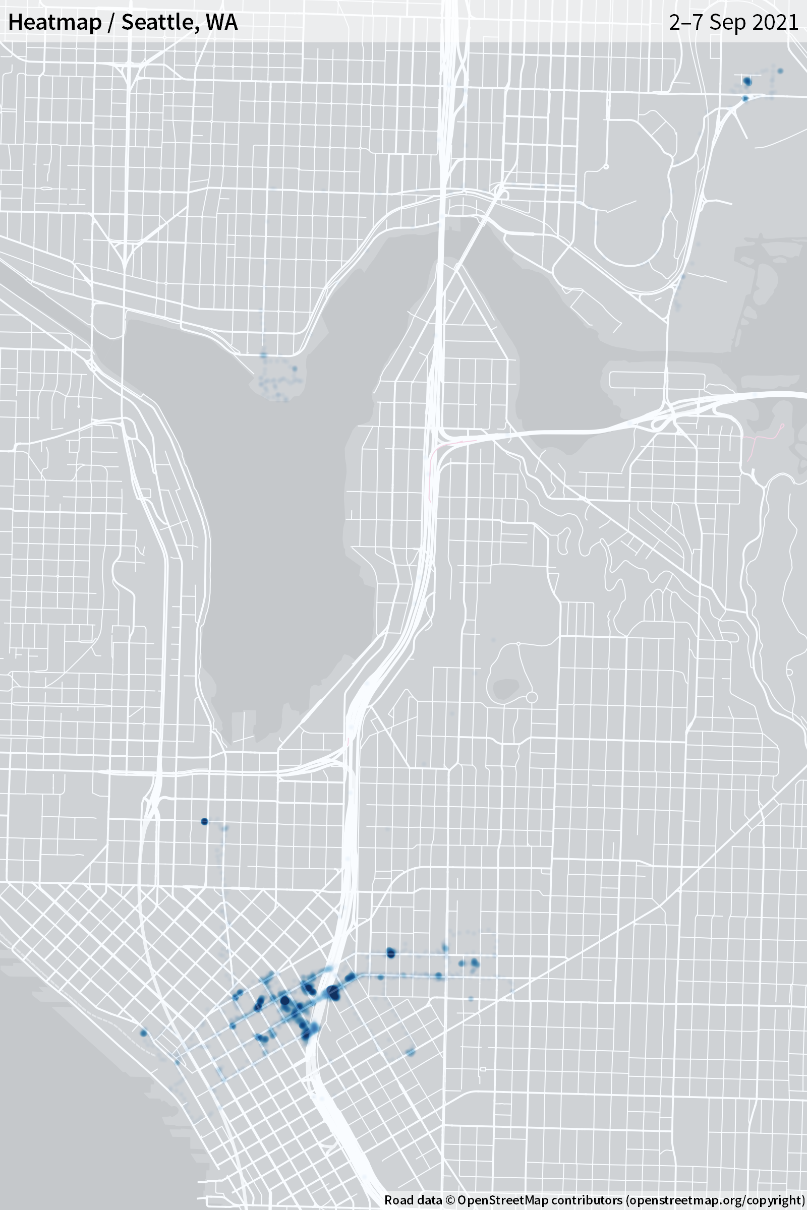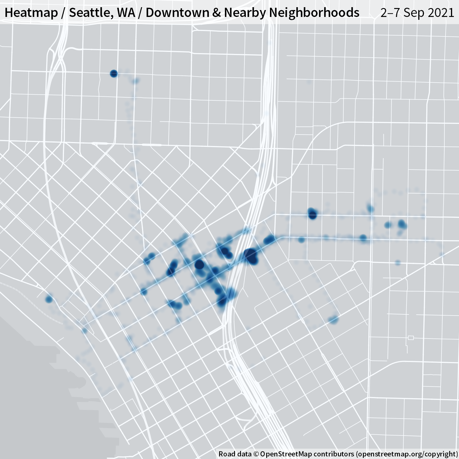

Taking my lessons learned from last year’s Cincinnati heatmap, I set my GPS logging app to record my location every 30 seconds—twice as often as the prior map.
I ran into the issue that Seattle is a denser city than Cincinnati, so it was more difficult to get a high-quality GPS signal in a lot of places. As a result, the GPS logger started out skipping recording location waypoints when the signal wasn’t accurate. This would have been okay if I was just tracking a route (since it would just result in a more jagged path), but a heatmap is explicitly trying to count the number of points spent near a given location (to weight the amount of time spent there), so skipping points wasn’t an option. I ended up having to set the logger’s minimum accuracy threshold to Low. Of course, this also meant my GPS data was noisy, but over the course of a five-night trip I was still able to generate a pretty reasonable heatmap from it.
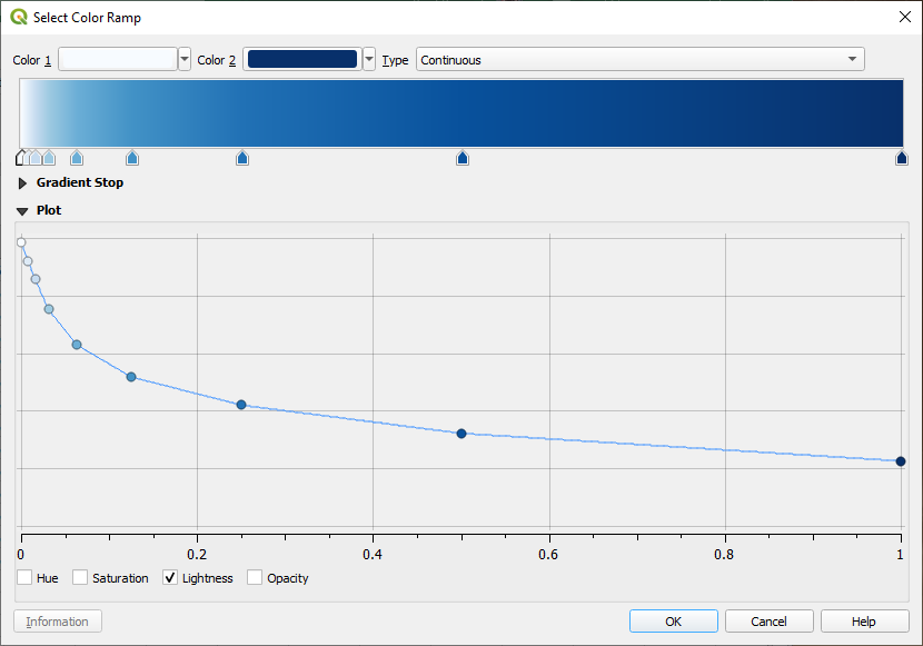
With this map, I also experimented with making my color ramp (light to dark blue) power-law instead of linear. I spent orders of magnitude more time in some places (my hotel) than others (walking down a given street once), so if the darkest blue was just set to the point density of my hotel, then individual points were so far down the color scale as to be indistinguishable from zero. On the Cincinnati map I solved this by setting the heatmap maximum value pretty low, but this meant that places I spent a moderate amount of time at (picking up dinner from a restaurant) were just as dark as places like my hotel.

The approximately power-law color ramp I used, with stops at 0.0%, 0.8%, 1.6%, 3.1%, 6.3%, 12.5%, 25.0%, 50.0%, and 100.0%.
Using a power law ramp meant the more waypoints were in a given radius, the less the color changed per additional point. This meant that I could show a visual distinction between locations with thousands of points and hundreds of points, while locations with only a few points were still visible.