I’ve been to a lot of conferences, conventions, and trips where a group of people are coming on several different flights, yet trying to share cars from the airport. Traditionally, this has been a bit of an organizational challenge, usually involving having everyone post their flights to a shared spreadsheet. I created Shared Itinerary to show everyone’s flights visually, so you can easily see who’s arriving and departing at similar times.

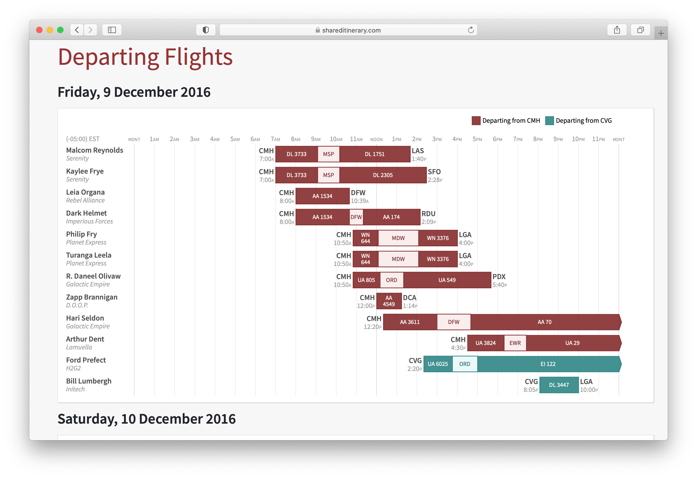
Chart showing what time everyone is returning from a fictional sample event.
Flight charts were the primary purpose of the Shared Itinerary. These charts showed flights and layovers on each day for each attendee. For arrivals, the attendees were sorted by arrival airport and arrival time. For departures, the attendees were sorted by departure airport and departure time. The flight bars were also color-coded by the event arrival or departure airport. This made it easy for any given attendee to see if they were arriving at or departing from the event at the same airport and a similar time.1
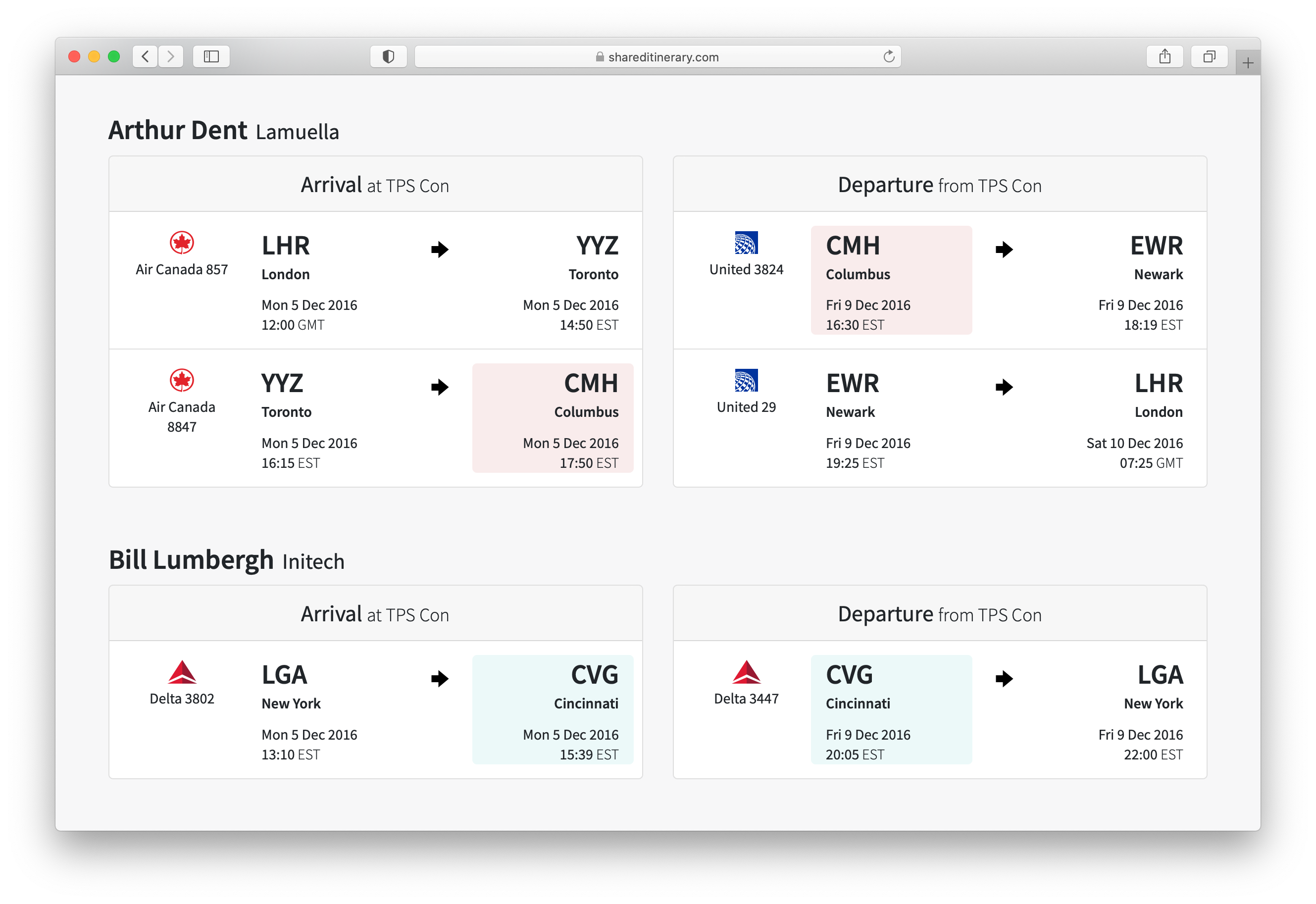
Below the charts were tables showing details for all of the travelers’ flights, with the event arrival and departure airports color-coded to match the charts.

Traveler itinerary details for the same sample event.
Travelers’ flight information was kept private. The creator of an event had to give out a share link to allow anybody else access.
The application was fully time-zone aware.2 The itinerary details table showed each flight’s times in the local time of each airport. Itinerary charts were shown with all flight times converted to the time zone of the event. The chart could handle flights that occur during a shift to or from daylight saving time (summer time) by showing fewer or extra hours on the time axis as appropriate.
Technical Details
I wrote Shared Itinerary in Ruby on Rails, using a PostgreSQL database to store itinerary data.
The attendee flight charts were inline Scalable Vector Graphics (SVG) images, generated using methods in a Chart class I wrote.
Shared Itinerary used FlightAware’s AeroAPI 2 to search for flights and to look up information about airports and airlines.
-
The inspiration for my chart design was the time bar layout of ITA Matrix Airfare Search; instead of showing a lot of itinerary options for one traveler, it’d be a single itinerary each for a number of travelers. ↩︎
-
All flight times were stored in UTC, and converted to whatever offset is appropriate for display. ↩︎


