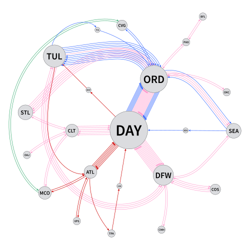
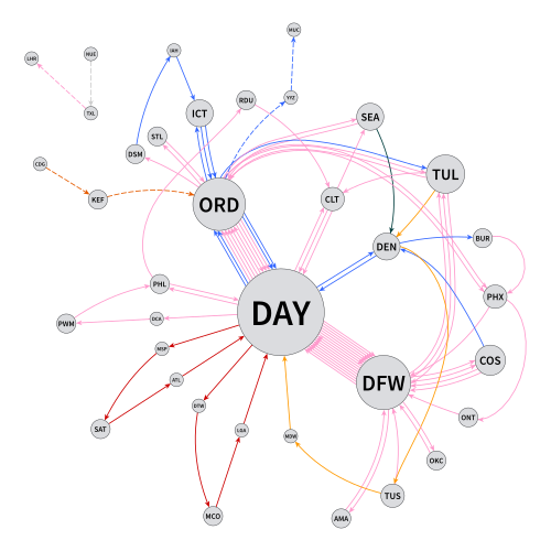
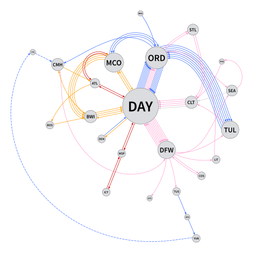
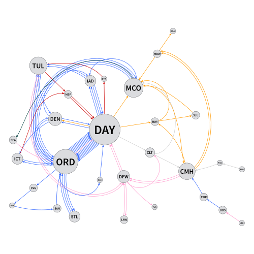
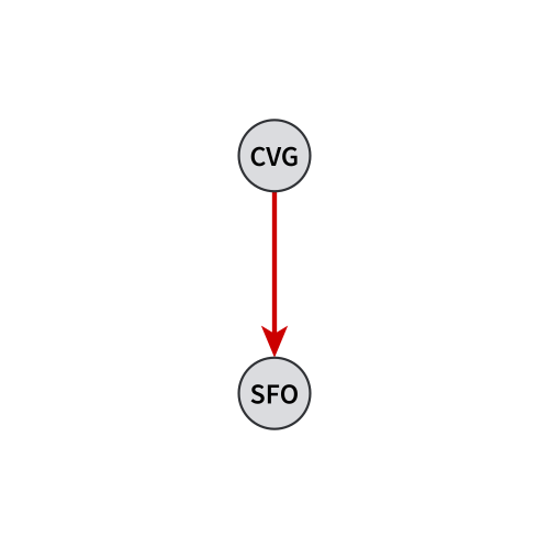
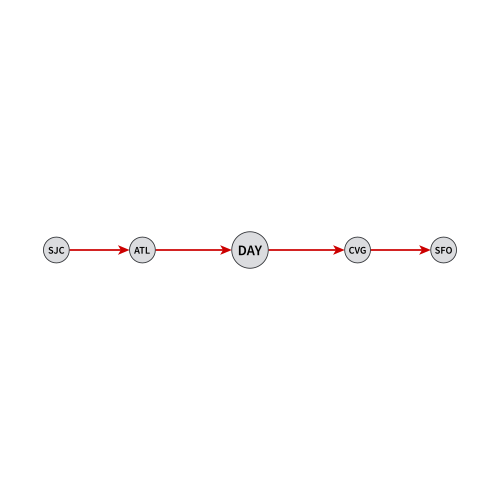
Flight Graphs
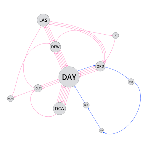
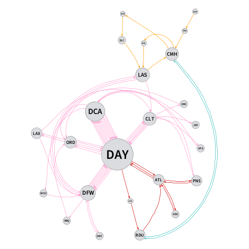
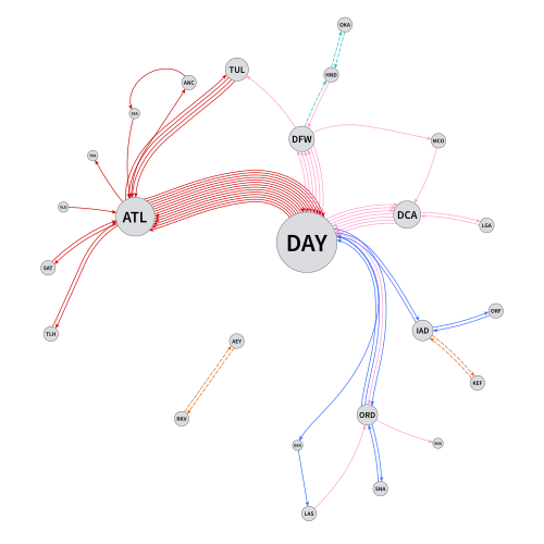
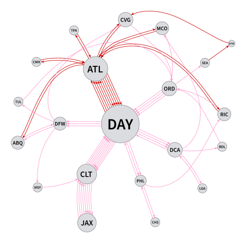
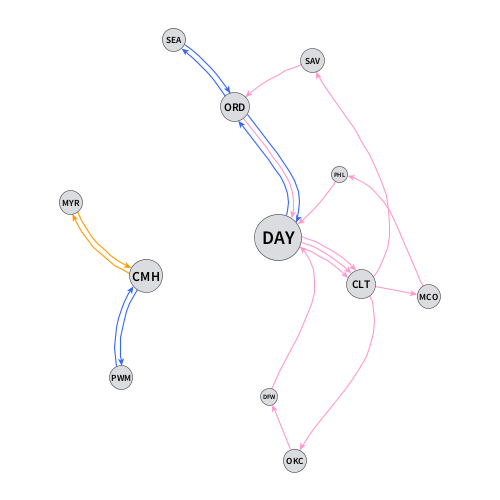
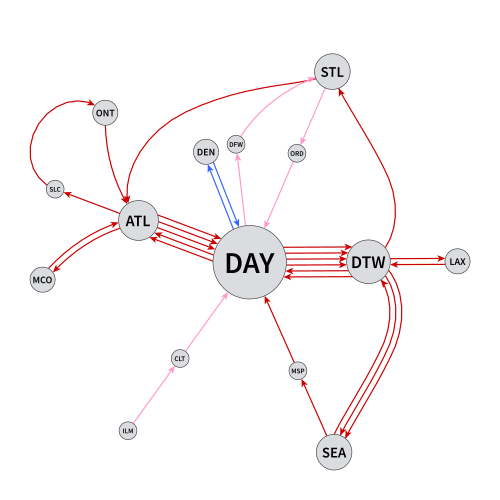
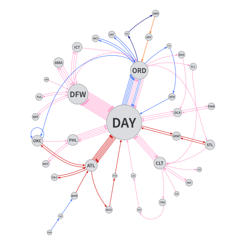
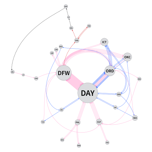
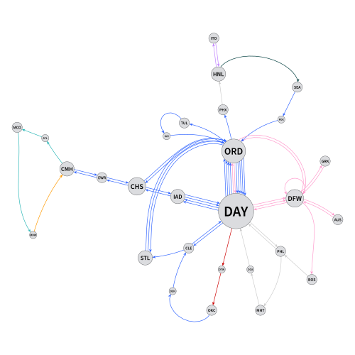
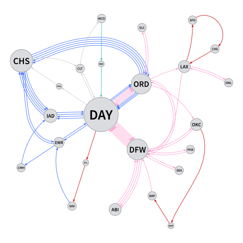
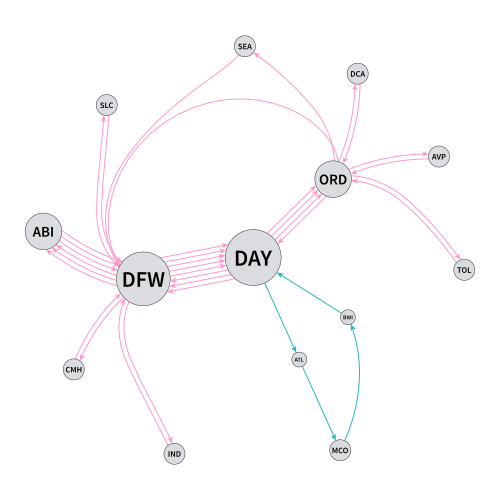
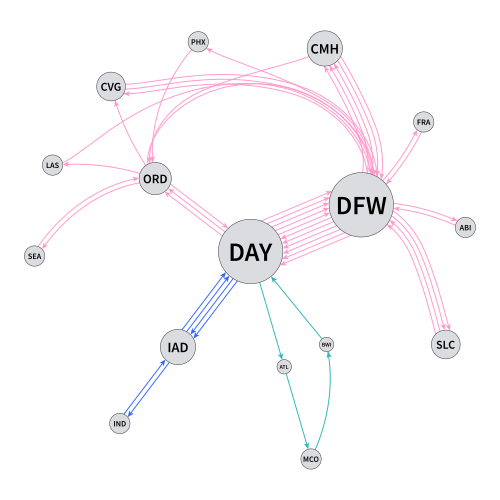
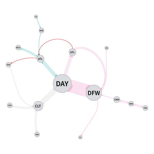
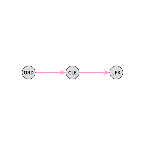
To visualize my flights for each year (from 2001–2025), I created a series of multigraphs. Each vertex (circle) is an airport, and the bigger the circle, the more often I visited the airport that year. Each edge (arrow) is a flight, color-coded by airline. This showed at a glance which routes I flew the most often (they had the most arrows), and which airlines I flew on which routes.
Gallery
Technical Details
I created my flight graphs as GraphML XML documents, and used yEd Graph Editor to layout the graphs and export them as SVG images.

To create the GraphML documents, I wrote a GraphML module within my Flight Historian, a Ruby on Rails application. I passed a collection of flights from the Flight Historian database (filtered by a given year) to a graph_flights method. The method then generated the appropriate XML for a yEd-flavored GraphML file, with airport vertexes/nodes sized by frequency and flight edges color-coded by airline.