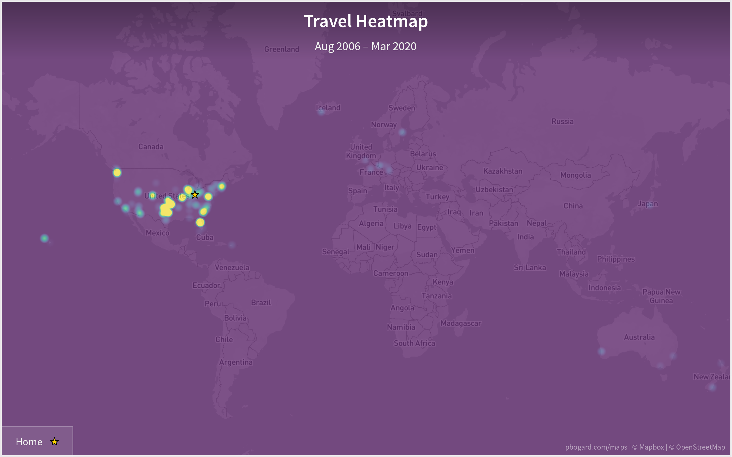
Travel Heatmap. Created 26 April 2020.
Basemap © Mapbox © OpenStreetMap (Improve this map)
For my 2010s Decade in Travel post, I manually created a heatmap showing the parts of the United States and world where I’d spent the most time traveling. Since I’ve been playing around with QGIS recently, I went ahead and used it to create a proper heatmap of my travels.
The hotter (more yellow) each area of the map is, the more nights I’ve spent there. The map clearly shows that the majority of my travel is within the United States, with a lot of travel to Kansas, Oklahoma, and Texas in particular. Other especially hot areas are Seattle and Orlando, both of which have had many work and personal trips.
This map data only goes through March 2020. Since then, I’ve found using icon size rather than color to indicate the number of nights spent in a place to be more readable, which is what I use in my recent Year in Travel posts.